In preparing for an upcoming retrospective exhibit I’ve looked through almost all of my work, finding old slides, illustration samples, and digital files. It’s been a ton of fun and taken me by surprise.
The show will be alongside work by Chica, Kate Darnell and Doug DeLind at Struk Studio. Reception on November 13 at 5:30.
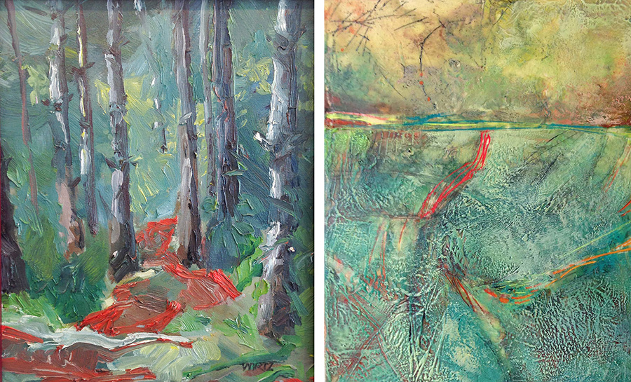
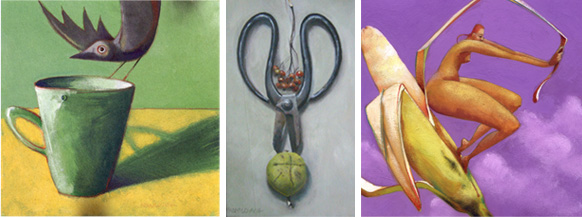
The big AHA moment was that I’ve basically been doing the same paintings my whole life. Figures in empty space, whether the figures be plants, people, landscape elements, or still lives. The above two pieces were done 40 years apart, but clearly come from the same way of looking at things.
Of course there has been variety along the way, but here are the elements that have held my interest throughout:
- Focus on the subject. I’m not interested in backgrounds, so I often leave them plain with maybe a hint of something or a shadow to create environment. Sometimes I wonder if I’m lazy, but don’t I get to do things in a way that comes naturally?
- Gesture. How does something move or hold itself and what is the story behind the gesture?
- Area of clarity. If everything is loose, I might add a dewdrop, a crisp mark, or luscious lips…one spot that says I could do tighter work with more detail, but am choosing not to – it’s intentional.
- Tight crop. I move in on my subjects. I want to see the little details and let the imagination make up the rest.
- Complex surface. I like painting in layers or working over other paintings. It seems to say there’s more to the story without giving anything away.
- Marks. I can fall in love with a good mark. It’s hard when I have to sacrifice a beautiful one for the sake of the overall piece.
- Drawing. I draw on my paintings and paint on my drawings, despite a college professor who wondered why. Why not?
I have been beyond lucky to have made my living as an artist for over 50 years. Between the illustration and fine art, there’s a big body of work.
For the exhibit I’ll show a bit of each era, including painting and ceramics. I hope you will visit David Such’s distinctive and cool gallery just north of Old Town on Turner street.


